
If you’re anything like us, you probably wake up in the middle of the night thinking: ‘What does website design entail? What is the difference between UI and UX design? What should I have for breakfast today?’
We can’t help you with the breakfast thing — but we compiled the basics on those other topics, just for you.
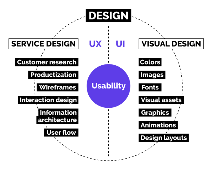
When website design as a subject is approached, UX and UI design are bound to pop up.
These two areas of design are much like great friends. They do everything from brunch to yoga together, and you can’t separate them (especially if mimosas are involved.)
In this article, there are no mimosas to be seen, but we will be talking about how UI design can be used to impact your online sales.
We also briefly go through the ways in which UX design and content can mold your website’s appearance into a functioning, effective whole. Cool, right?
(If this sounds interesting to you, you can sign up for our newsletter below, and get awesome content like this directly into your inbox. Wow!)
What is UI design and how does it differ from UX design?
This is a question you’ll likely encounter at the very beginning of the process. What is the difference?
A fair question, and a difficult one at that, so maybe we just won’t answer it. Does that work?
We will instead guide you toward this sentence since it’s pretty much an accurate description of the different roles of these two areas:
“UI is the saddle, the stirrups, & the reins. UX is the feeling you get being able to ride the horse.”— Dain Miller.
Also:
“Horses are cool.” — Advance B2B, but that’s irrelevant.
.gif?width=750&name=giphy%20(21).gif)
Back to the topic: The task of the UI designer is to mold the website into a visually clear entity that guides the website visitor intuitively. The visitor should be able to solve whatever problem they have with help from the UX designer. Both are thus crucial.
But where should you get started?
What you need in UI design for the best possible result (also known as more sales?)
Visual design is not math; there is no perfect formula to get customers to buy more from your website.
Yet, there are certain things to keep in mind when planning to design a website that serves customers and sells well. Let’s look at those.
Never skip the basics. Coming up with a nice-looking site with pretty pictures and animations is no guarantee for sales or a stronger brand image.
Here is a list of the basics a SaaS company should at least consider when targeting growth through online sales.
1. Goals
Before you can properly design a structure and look for the website, you need goals in place.
This is actually important in every project ever, so better make a mental note already now.
Think about things like:
- What is the website designed to do, and what does it offer customers?
- How is the website supposed to support your business?
- Is the site intended for presenting the brand and its products, is it supposed to generate sales by producing leads for the sales team? Or perhaps free trials, freemium users, or paying customers?
Once the goals have been defined, you can move on to designing your content, the site’s functionalities, and the likes.
Site functionalities
The goals of the site also directly determine the functionalities needed.
When it comes to your site’s functionalities, you should make a distinction between things that are genuinely important for the business and results, and those that are simply nice to have.
Typical high-priority functionalities can include:
- contact forms & booking calendars
- chat functionality or chatbot
- online payments
- integrations with the company’s other systems
- language versions
- content feeds and filters
Content
When a website is designed to produce sales leads or direct sales, you need to consider how the site serves customers at the different stages of the sales funnel.
Also, what kind of content the site then needs.
We know that “content is king” and “content first” and all that jazz, and we also love content to bits, but it does need to have a point and a function.
Much like this blog post. Not just content for content. But actually, a point. Somewhere in there. We swear.
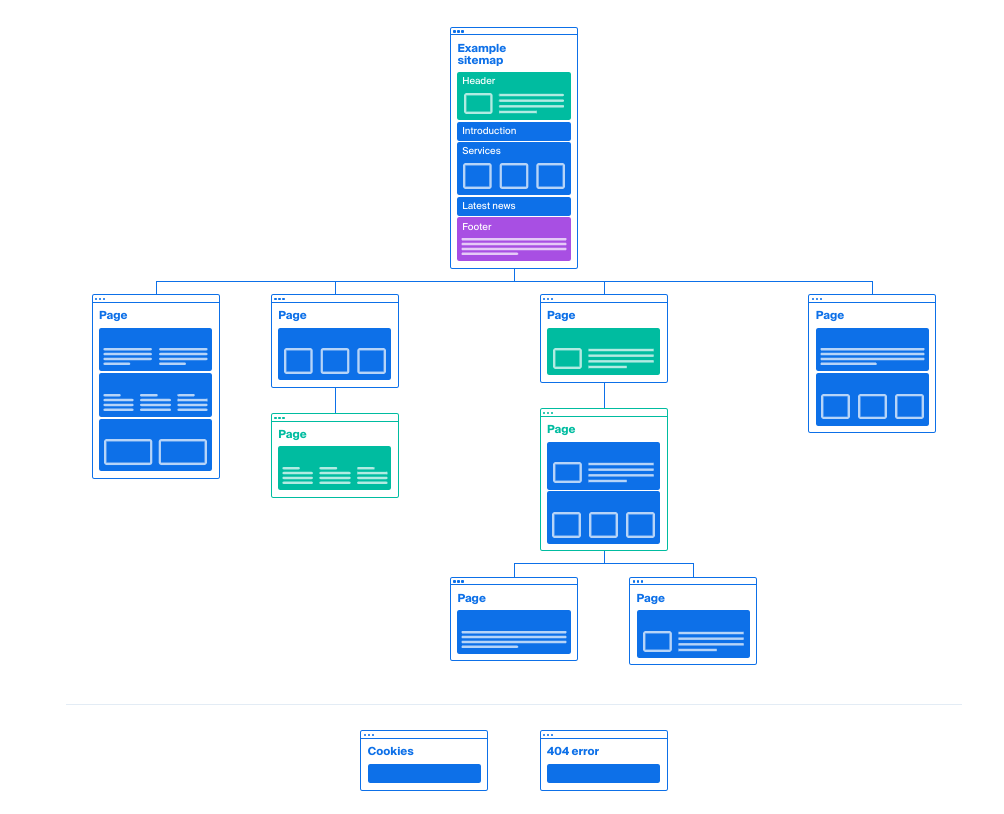
With the help of a sitemap, you can determine the structure of the content and think about the types of content each page will have and in which order.
This way, the customer can find their way through your site at every stage of the funnel.
Creating a SaaS website that supports sales and branding relies on successful content.
No visual measures can compensate or save bad or insufficient content, but well-designed and well-written content can be boosted with awesome visual elements.
2. Structure and intuitiveness of the site
Customers want to find the information they seek easily and quickly.
In other words, much like with any design, the website structure should be designed to be clear and intuitive to use.
At this point especially, UX and UI design overlap, as UX design is used to determine which content and functionalities the site presents and in which order.
Make a wireframe
Before the actual visual design of the site, a wireframe is useful for laying out the website structure and functionalities.
Wireframes do not address the appearance of the website but seek to make a more detailed plan for the site than a preliminary site map in terms of the content structure and site functionalities.
But this is something that you might need to make extra clear if you’re showing the wireframes to anyone: They are not the final design nor will the site look like this, don’t worry.
Wireframes make it easier to focus on estimating what’s relevant in structure and functionalities at a point when the attention is not yet fixed on the other details such as colors or images.
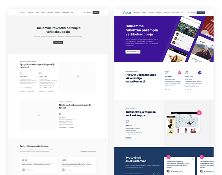
Once you have used a wireframe to define the site’s structure and functionalities, you can use UI design to strengthen the site’s usability and user experience.
This way, it is easier to design visual elements that guide the visitor intuitively to the desired direction.
(This is what it looks like in practice)
Data is your best buddy
When designing the structure of the site, don’t guess. Use existing information and visitor data if it’s available.
Visitor data provides easy access to information on what has worked well on the old site and what hasn’t. Make sure to consider this information in the design of the new site.
Even if you don’t have visitor data at your fingertips, don’t forget about your customer.
Site structure
It’s also no coincidence that many SaaS company websites are very similar in structure. Customers are already used to finding information on a website in a certain way.
Here, you should note a psychological phenomenon called the mere-exposure effect. This means that people prefer things they find familiar, and if something is too unusual for them, it may be considered unreliable.
In this sense, it is ok to copy from others to reach a good customer experience when designing the website structure.
For example, many SaaS customers are used to seeing pricing options like this:

Example from GitHub
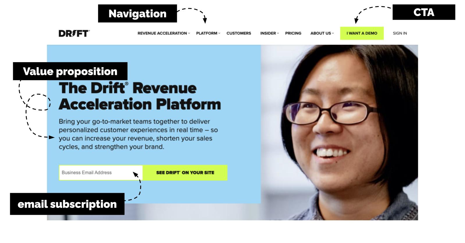
A typical SaaS website’s front page often includes the following:
- top navigation bar with most important site links
- main image of the product or service
- headline / value proposition
- call to actions (CTAs)
- social proof, i.e., client logos, testimonials from pleased customers, awards etc.
- demo video of the product or service
- other browsable content with additional information for the customer, such as a blog feed
- contact form
- chatbot
- footer

Privy has their price calculator at the bottom of the page.
When you have all this, you can move on to using visual selections and written content to stand out from competitors. Also, remember that changing visual trends impact the image and expectations users have of a certain industry.
This is why it is important to keep track of current visual trends and use them in the visual design of the site, bearing in mind the specifics of the brand so that the end result lives up to user expectations to a necessary degree.
3. Visual appearance
When you finally start designing the actual look of the site, start with your company brand.
The brand is the company’s single most important area, and it should also guide the visual decisions of the website’s design process. Always examine the website as a part of the bigger brand.
A visually impressive and functioning website doesn’t quite cut it in the long run if the brand itself falls short. Or if the website is not in line with other areas of the brand, such as the product sold on the website.
The customer experience needs to be coherent and convincing and in line with everything else you’ve got going on.
The starting point for everything is a well-defined brand that is recognizable and coherent across all channels, speaking to the right kind of target group, and guiding the right group of customers to the site.
It sounds harsh, but you don’t want those irrelevant people on the website.
4. Clear website with a consistent appearance
In addition to having a website appearance that’s in line with the company brand appearance, the appearance must be clear and consistent in usability.
Colors, fonts, images, and graphic elements should be used systematically throughout the site, providing a clear and easily digestible whole for the visitor.
Don’t forget that mere-exposure effect thing, since it applies here, too.
The appearance of buttons and other visual elements guiding navigation should be designed in an easy-to-understand way, guiding movements smoothly.
Put simply; a button should look like it guides the visitor to click, ensuring that the conversion points defined for the site stand out in the desired way.
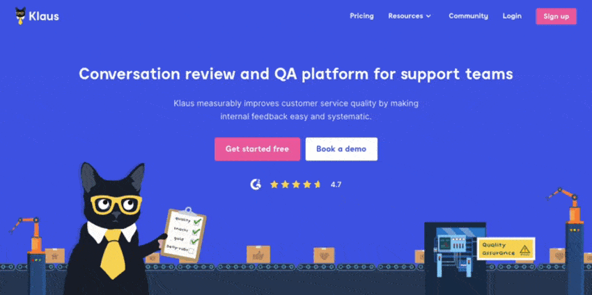
Your buttons should stand out. On the Klaus website, the main colors are blue and white but their CTAs are pink.
Accessibility and intuitiveness through different elements
The clarity and intuitiveness of the site can be influenced through different color selections, clear and distinguished typography, and the placement, rhythm, and shapes of elements—and these are just a couple of examples.
For example, color and typographic choices should reflect the fact that the site can also be used by visually disabled or colorblind visitors.
The colors should have enough contrast and be distinguishable in the main elements, such as buttons and other links.
Ensure enough contrast between the text and background color. Also, it’s a good idea to consider font readability on the screen.
Creative solutions
Artistic solutions on different websites serve a purpose, but on a website designed primarily for sales, decisions should be based on providing clear guidance for customers to operate and move around on the site.
Animations can be used to bring more interesting content to the site and guide navigation, but avoid unnecessary animations if you don’t want to leave your visitor confused and potentially annoyed.
Pretty much everyone hates pop-ups you can’t get rid of, so make sure there are no loud videos playing on your site.

Calendly uses animations effectively and in a nice way.
5. Reliability through visual means
A coherent customer experience can strengthen your brand image and increase the credibility and reliability of your product or service.
Social proof
Customer references should feature human faces and company logos. For the visitor, this signals that the reference stories are not made up but are actual customer statements.
With traditional products, a lot of companies add pictures of their employees on their website to make them feel more approachable and real.
With SaaS, this is not as crucial. However, we do recommend bringing a slight bit of a human touch to the site, especially if you have any thought leaders that can use their personal brands to boost your company brand. Fun!
For customer references, pictures and logos are a must—if at all possible. Quotes just sound more believable when they’re presented with someone’s name and image.

Intercom uses logos and pictures of their customers in their customer stories.
Make it easy to say hi
This should go without saying but: Contacting customer service should be made as easy as possible.
Especially when a company sells a product on its website, the visitor should be able to find contact information for customer service right away. If they need to look around at all, it’s not easy enough.
Having customer service and contact information on the site with clear and visible placement also creates a credible and reliable image of the company, product, and service when the customer is only getting to know the product.
Don’t leave the customer hanging here (or ever.)
6. Mobile usability
Digital content is increasingly used on different mobile devices. This is why the appearance and usability of the website on mobile devices matter.
Always make visual solutions that result in a clear and intuitive appearance for the site, also on a small screen.
Elements, such as buttons of important conversion points, and the visual appearance, should be simple and clear.
Use the placement and size of buttons to ensure easy access when a mobile device is used with one hand.
Bear in mind, too, that hover functions activated by a mouse don’t really work on mobile screens all that well. So maybe skip those altogether.
Sometimes it makes sense to redesign some elements altogether for mobile devices, or get rid of some functionalities that don’t work well with mobile — also to keep the site length somehow manageable.
Through these small tricks, you can improve the user experience of the website and facilitate buying on all devices.
Your customer should be able to decide when they make a purchasing decision. Your job here is to make this as easy as possible when they do decide to buy.
7. Visualizing a product or service
When selling anything, but especially a complex SaaS product or service, your potential customer most certainly wants to know how the product or service works.
They’re also interested in what value it can have for their company and how it differs from your competitor’s offering.
The benefits should be communicated clearly and concisely.
Well-designed illustrations or introduction videos on the product’s functionalities and its value are an excellent solution for this.
Illustrations and videos facilitate the use of the product or service and can be used to support your written content.
Pro tip: Unique and brand-specific product illustrations and videos are also a very good way to stand out from competitors that offer similar products or services.
Before designing the website illustrations, consider their role: Will it be a visual element to create a brand look for the site or a certain image for a service or product, or is its primary function to demonstrate a product’s certain functionality, service stage, or customer benefit?
And, don't forget that our customer is not as interested in your website as you, and they want to find information easily.
As your potential customer lands on the site and gets to know the content, they probably don’t want to spend the whole day there. Offer them an easily available overview of your product or service.
Keep main points on the home page and in-depth visual presentations on sub-pages dedicated to actual functionalities.
Trello has cute illustrations that are both product-related but also brand elements.


Notion uses animations to highlight product features.
Visuality is a way to increase organic traffic besides strengthening your brand message, supporting the content, increasing the credibility of your product or service, and helping the visitor navigate the site.
Different illustrations and infographics that support blog content on the subjects customers are searching for are a great way to attract potential customers.
When something interesting is visualized in a cool way, people love to share the content in their own social media channels. Yay!
A brand your users love and view as reliable is fuel for sales.
8. Continuous testing and development
Your website is a journey, not a destination. That means a website that works and sells well is never complete.
Remember, visual design, especially the design of a functioning website that sells, is not math, and we don’t have an optimal formula for designing a successful website.
This means that you should always test and optimize your finished site and continuously analyze results.
See where you’ve done something right and where there’s still work to be done.
The digital world is developing rapidly, and a website that converts must keep up with these changes.


